

Project Overview
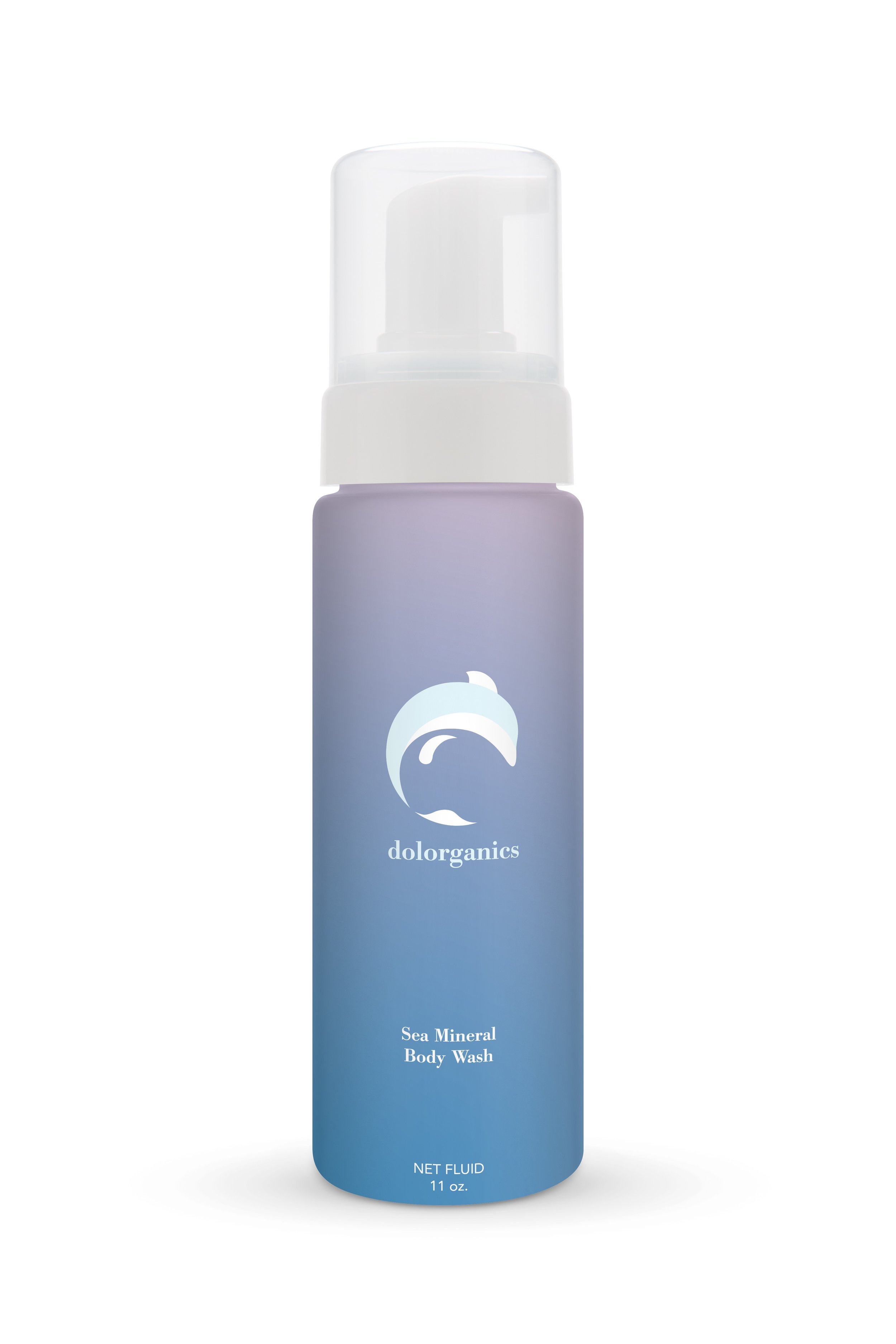
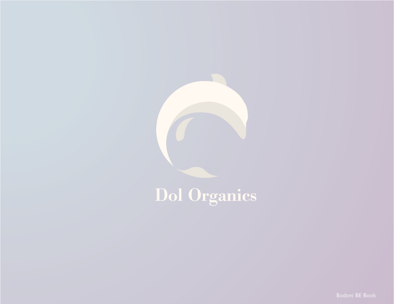
Dol Organics is a new skincare product company located in San Francisco which started by Suyeon Hwang in 2010. The company is represented by a dolphin as a figurative trademark.
In this project, we were challenged to design a trademark focused on form development to achieve a dynamic balance between meaning, expression, beauty and distinctiveness. The development provided opportunities to explore the principles of gestalt, figure-ground, juxtaposition, metaphor and character depiction.
Project DUration
Initial Sketches/ Researches: One Week
Sketches/ Refinements: Two Weeks
Finals/ Deliverables: One Week

Application


Process
Explore
First step is to define and practice the shape of the dolphins. Taking close look at different angles, I created as many sketches as possible to expand the possibilities. I had two different directions in minds: A) something that would capture the moment of the dolphin leaping out of the ocean; B) a simple mark that would reflect the elegance of the dolphin and also tells something about this product.

Develop
After the sketches, it is down to two direction and I dive in to the details of each individual shapes.

Precision
With the ideation almost ready, it is now about the typeface and color that would benefit the style of the shapes, and reflect the product itself.


Final Lockup


PROJECT STATEMENT
I choose to leverage the elegance of perfect circles to imply the shape of a dolphin. My design solution is to play off the idea of foreground–background relationship. I make the negative space under the dolphin as a piece of water drop. The tail part is constructed using three circles, which implies sunrise as well as a leaf. The color of the logo focuses on the natural aspect of this product.