

Project Overview
Children Awaiting Parents, Inc. (CAP) is a national, nonprofit 501(c)(3) organization governed by a volunteer board of directors. For 40 years, we have been dedicated to finding adoptive homes for America’s waiting children.
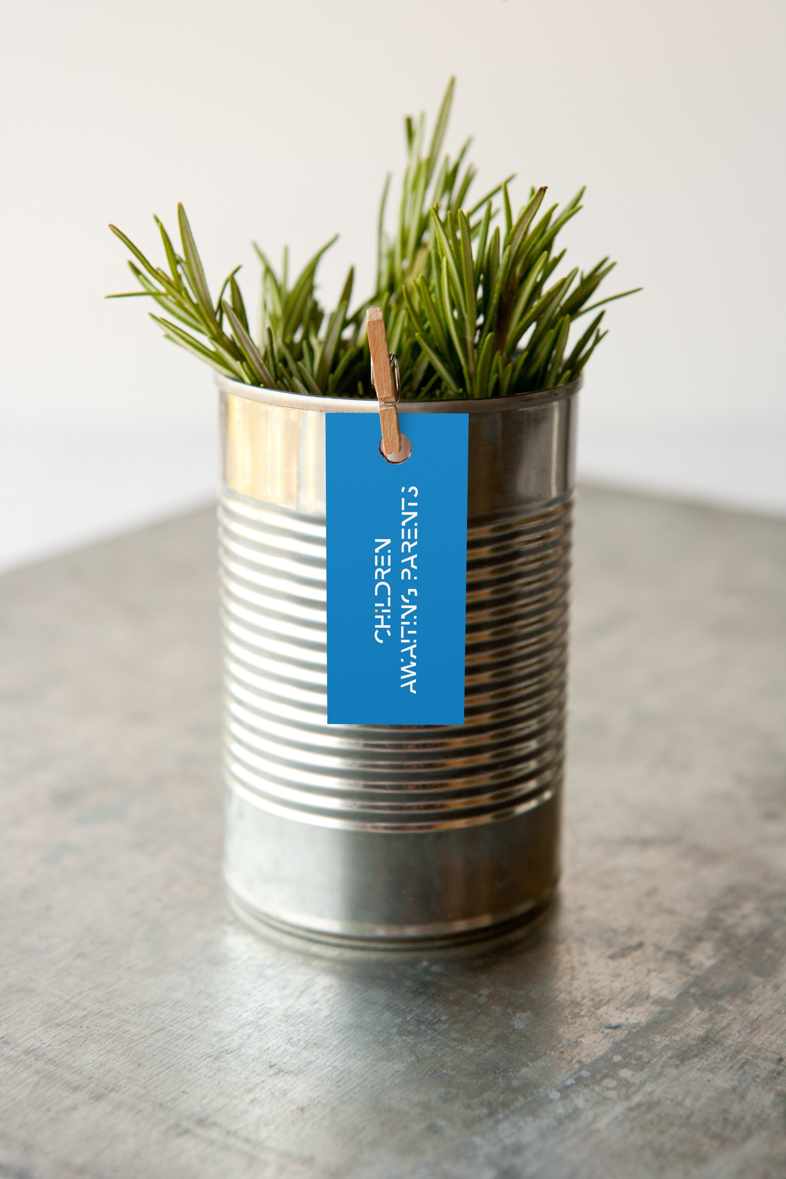
Spotting the problem in the existing logo, I developed a new identity focusing on the core idea of missing. Create a fragment effect that hint the missing elements in the letters. And the missing part in a family.
Project DUration
Initial Sketches/ Researches: Two Weeks
Sketches/ Refinements: Two Week
Finals/ Deliverables: Two Week

Application
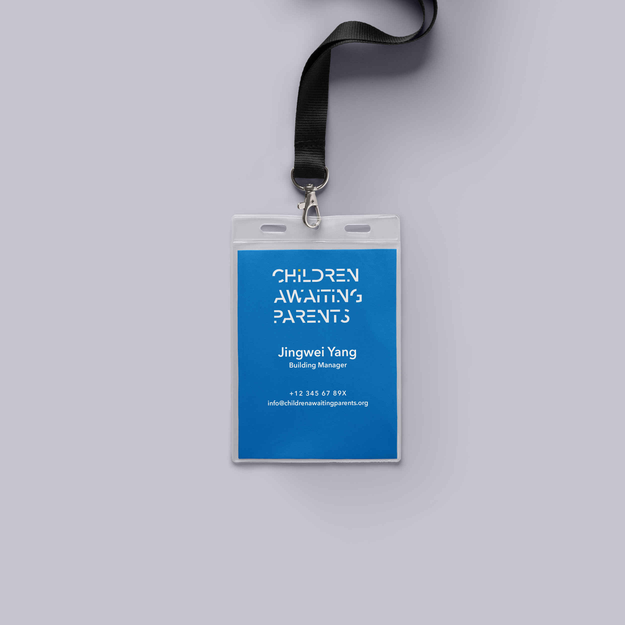
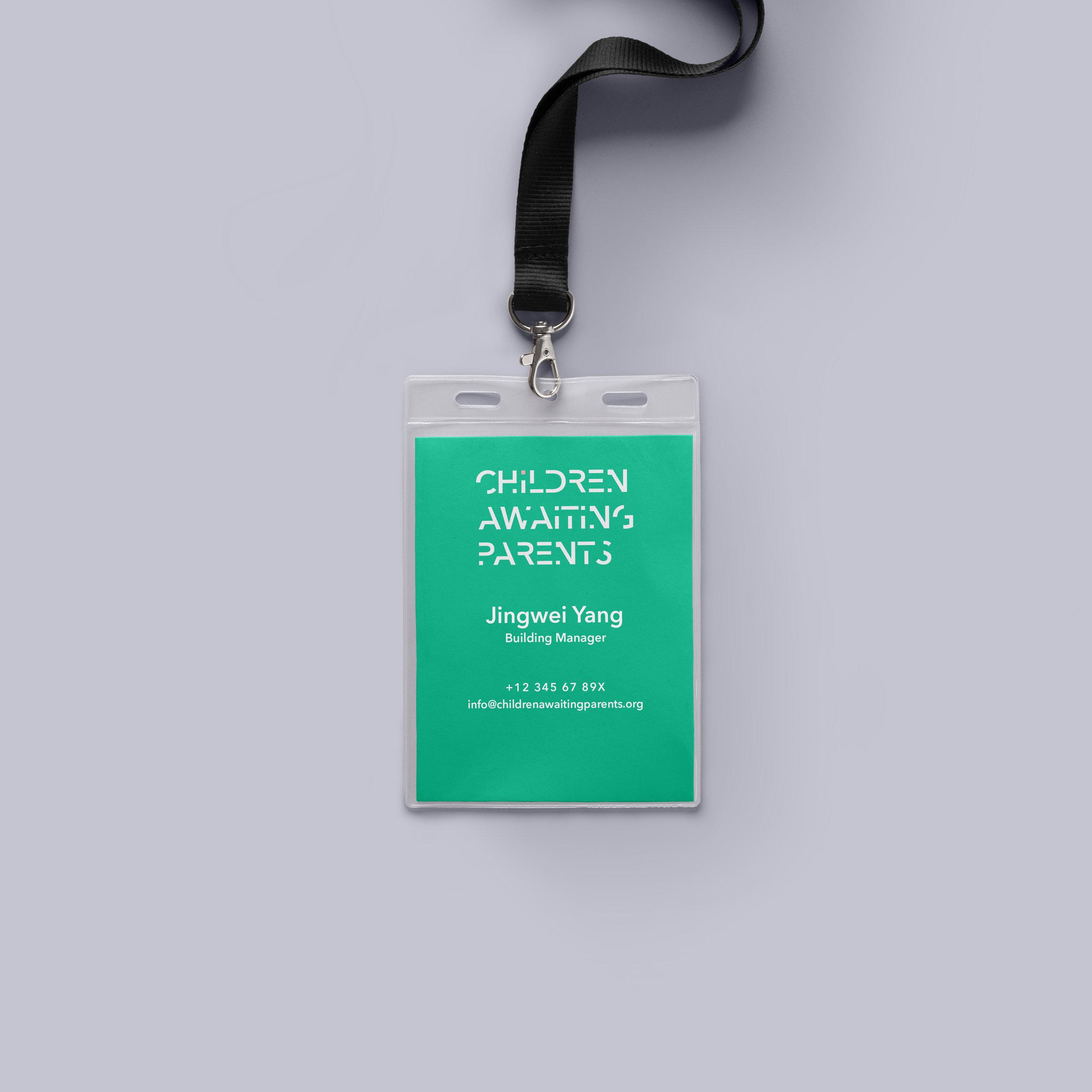
Name Tag


Stationary

Accessories


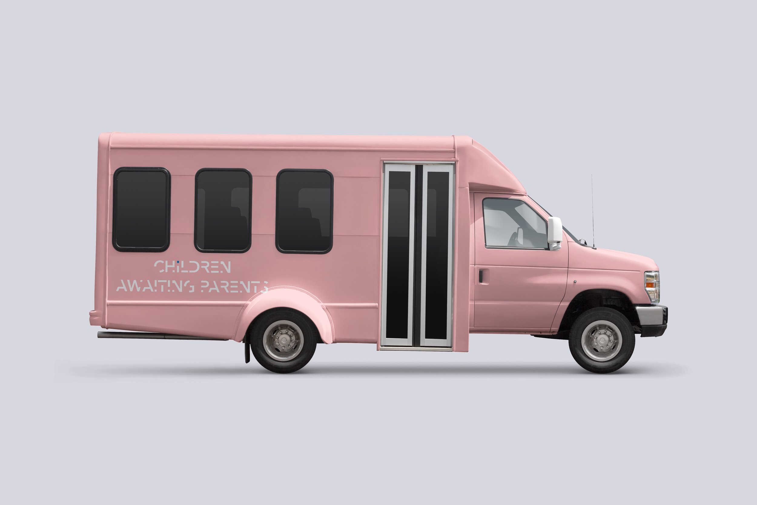
Vehicle

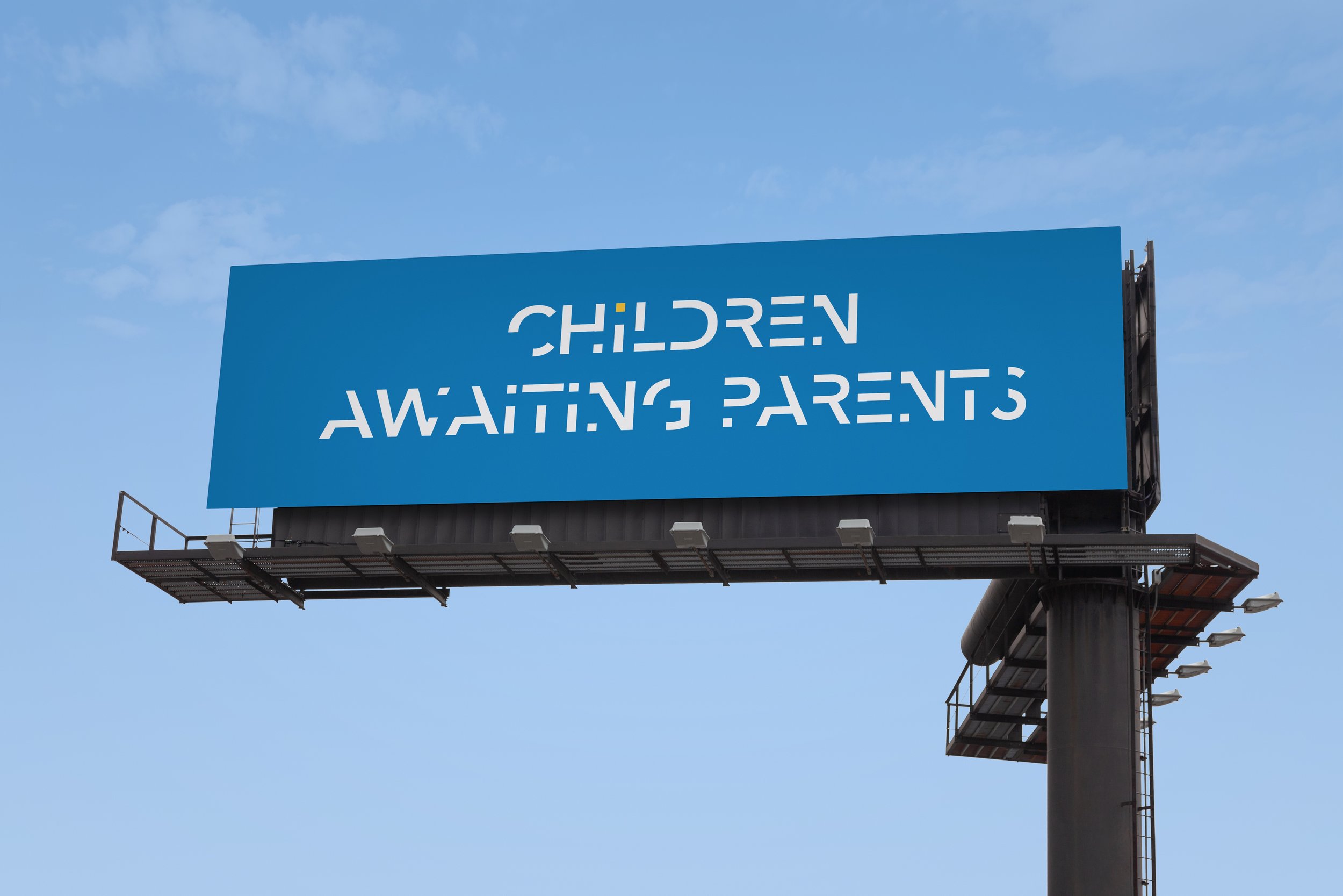
Outdoors

T-Shirts


Gifts


DESIGN


Research


PROJECT STATEMENT
I choose to uses a different mood when designing the logo. My design solution is to play off the idea of missing. I make the knock-off type as a way of display the missing of family, and the waiting child is highlighted with a spot color. The overall color of the logo uses a rather optimistic palette, suggesting hope and future.